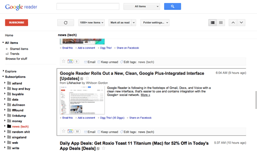
I’m a heavy Google Reader user and I’ve been anticipating the new interface for a couple of days. It finally turned up on my account today and while it’s all mostly good, I have to say I am a little disappointed.
Too much black and the light gray accents are practically white. They could have used a bit of colour like what Helvetireader used to do. My biggest peeve, however, is that the previous/next item controls have moved so far away. My wrist’s (touchpad/mouse) reflexes are in for some re-training. For the first time, I am wishing there was a “-1” button.
